Showing posts with label business card. Show all posts

Friday, 31 October 2014

Business Card: Evaluating

Business Card: Evaluating


Measuring Success

To evaluate my success, I should look if it has transferred the message. Does the logo look smart, elegant. Does the logo feel optimistic, friendly, cheerful? Is the mnemonic easy to be noticed and does it make the company name easier to remember? Does the font look simple, easy to read, and friendly to the eye? Does the design on the back attract attention, make it unique and recognisable. Does the layout on the front have harmony - Does it look neat, organised, appealing and comfortable and nice to look at? Do the colours and gradient feel smart, exciting, trustworthy, and professional? (Does the change in size make it look more "perfect", balance, good-looking?

Evaluating Success

Feedback


  • When first seeing the logo, most people recognise it is a face, but 3 or 4 thought it was a swan (which I knew people would, which is elegant).
  • They felt weird when the lines are all curvy, and things looks smooth and elegant, and the work "industrial" came out. This isn't much or a design problem as it is a purpose that it is made smooth and elegant, to cover the actual thing of manufacture. I should just maybe consider myself as "designer engineer" or just "designer".
  • The card doesn't exactly suit my job. It looks more like a doctor's or a dentist's business card.
  • The box that only has three side completed didn't look so good. (My idea was to make it like a tab coming out from the side, but they thought it makes it look uncompleted). Four sides making a sealed.
  • The corners on the back looks kind of empty (I don't agree much with that, the main attraction is in the centre and if more is added it would be too much, and there isn't much to add)
  • The logo looks elegant and happy.
  • The face looks smart and confident.
  • The blue have a sense of hope, like the blue sky.
  • The front is organised, tidy, and is good to look at.


Personal Thoughts

Yes, I think the logo blue, shining eyes look very smart, and adding the small smile there (eye), looks trustworthy. The whole logo definitely look very cheerful , optimistic, and friendly. Orange give a sense of fun, while the lines are all curvy, looking organic and smooth, light, easy, relaxing. It does look kind of like a swan so its elegant. Also, it has a big grin and a smile in the eyes. I think the S across might be a bit hard to see, but the rest of the mnemonic is quite noticeable. I think once you notice it, the whole smartness, trust, grin, and the name should be tied fondly. I think the font is pretty good, and it makes it look more like a business card because most cards and some formal things use it. So that the whole card doesn't just look "fun" and impractical. The logo on the back is quite good. The layout is great, there is enough white space. It is organised when the logo is on a side, and the information on the other. However, balance is okay remained because their size doesn't vary a lot but the text might seem like many things when a logo is one. The fact that orange feel heavier did help a bit.

I agree it's kind of like a dentist business card. I think it might lack some corners and squares. I also think the blue was too much on the bright side. Also, the grin on the logo might just be too big, "seems like half of the logo is on the grin so maybe there's something to do with the mouth..." but there wasn't, so not too good there. I think the lines on the back does look appealing and smooth, but then it start to look like lines on a notebook, kind of annoys me a bit. Also, the white might just have contributed more to the dentist part. There might be a little too much repetition for the logo in the front and back, especially with the fact their sizes are similar. It might be okay, doesn't seem to bother me a lot. I think the colours look smart, and cheerful, not very professional because there is very tiny bit of grey (the gradient and font helped with this aspect, but still it's not calm enough, cool but not calm). Except the blue looks too "dentisty". A mistake that wasn't intentional is that the front have too much orange when it's only suppose to be about half. That was because I was working with a too-big-bleed, and I didn't saw that when I zoomed to normal and check because the bleed did had a lot of blue. I think that has to be fixed before printing, short-term stuff to fix but important. It doesn't look very technological as I wanted it in the brief.

So for myself, I'll give it a 70%.

Improvements


  1. I think I should change my position into "Designer Engineer". I make this change because a smooth, elegant, smart, and cheerful design doesn't fit industrial. However, there is no way we should make it look like factories, square, and pollution, that doesn't help people buy products. Therefore, I will turn it around and make my position fit the branding. Which would "Design Engineer" because design comes first but engineer also comes as a part of my job, I don't just design, so I don't want to take that away.
  2. To solve the problem of it looking too much like a dentist's card, I think I should make the mouth of the logo smaller so the focus doesn't go too much to the oral part. Also, the blue on the eye I can keep maybe, but for the rest of the card, I am going to tune the blue to less green and less bright.
  3. To solve the problem that the lines on the back look too much like notebook lines and complicated, I propose three ways to improve and see which is the best a) turn the opacity down b) delete the lines c) Put a small logo on right corner and thicken the lines a bit. Turning the opacity down might help make it less complicated but will still look like a notebook probably. Deleting the lines will make it much simpler, but then it might be too empty. I would make the colour a dark one, maybe brown, and no gradient. Some flatness might look good because. And the brown seems lacking and it contrasts with the logo, so it's mainly for visual affects, not branding. Putting the logo out of the way but making sure it is there. The lines might look good by themselves but then more movement and 3D will look much better. It might also get rid of the repeating logos on both sides of the card.
  4. There is too much orange on the front side and the gradient was hard to see. To solve that, I would put back the exchange point of colour as 50%, in the middle. Or adjust it if it's not good.
  5. To make it more technological, it might need like a redo. Because this card is no where close. I imagine it to be more straight lines with round corners and grey a darker green and blue gradient. But now I think that I'm more of a designer first. However, still, the company isn't all about design, so some feel of technology is needed.

Impact

Our company sells electronics that is used in a person's daily life. We want to transmit the idea that we can make their life better, and I think the smile in the mouth and eye does express it. I mention smart is the human's goal now in the design brief and we want to express it and the blue and the blue eye helps. Although we mentioned about fifty-year old people, this card mainly focuses on teenagers and people in twenties. They seek excitement and orange is exciting. Some 40-50-year old might also be interested, but the card is not as much speaking to them. It doesn't look very luxurious though, and not very cool, maybe more grey could help. I mentioned that our clients love technology, and that is true, but I notice companies like samsung and apple and LG don't put a very technological look in it. It attracts attention; It has mnemonic device to help it be remembered; The colours are basically the colours of the company logo so they should be associated and easy to recognise. It fulfils my design brief okay and is probably going to be recognised and help the branding and feel for the company not too bad. Except it fit adults less and it's not luxurious or technological.

Tuesday, 23 September 2014

Business Cards: Developing Ideas

Business Cards: Developing Ideas

1) Design Specifications:

  • The final digital file will be in a common format such as jpg, png, tiff.
  • the final image resolution should be no less than 300dpi to ensure quality.  
  • final card designs will include a 0.125" bleed on all side
  • It should include my name, email address, phone number, and position in the company.
  • It should have the full name of the company, location of the specific store, and website of the company.
  • Logo will be in the business card.
  • It will have two sides.
  • There should be some sort of space in between each kind of information.


2) Design Ideas:

Back Design:

This is a back design. It is made according to the colours of the logo. It will be based on the shape that is drawn in the draft. Whether or not there will be space in between different colours will be decided once it is chosen. The colours will manly be bright and will be attractive. And given that big surface area, it will really grab attention. (It might be gradient or not).

This is one of my designs for the back of my business card. It has the logo right in the centre, and would work best for circular logos (because they make it look even more balanced, centred). The size of the logo shown is about the ratio of what you are seeing in the image of the draft. It has to be big enough to be clear to see and attractive, it can't be too big or else things would lose proximity. The pro is that it is simple and the logo will be very recognisable because it's only the logo in the whole page. The con is that it might result in too much negative space leading to a plainness. (It might be 3D or it might not).

This is another back design made according to the other green business card on top. It uses lines to create a flow and it looks interesting. The curvy lines would make anything look very friendly. The lines would mainly follow the flow of the logo, works better with logos that are less square or circle-ish, and that are more curvy. The flow is special and would attract and is memorable. However, it would be tough to make this. One main colour (related with the logo and company) will also be chosen, and there will be lighter and deeper parts but using the same colour.

Front Layout:

This is a portrait layout. The logo will lie on the top 2/3 (imaginary) line and the name of the company is going to go below the line. The rest of the information will take up half the page, and the text is going to be centred. The logo will be about the same ratio as on the image above. The logo will be big enough, and you will always see it right on top and pay attention even when you are just looking at the information. However, it should not be used with the "logo in the middle" back design because it will be too repeated with both in the middle and start to be annoying and irritating. It is also because that one looks better horizontally but this is a portrait layout. Another con is that it might grab attention from the information. That doesn't matter much because when you need the info you will sure pay attention to it but it creates an unbalance vertically. Ratio: 20:13

In this layout, the logo will be on the left, and on the right there will be a rectangle with my name (big) and my position. The rectangle will be about the middle (vertically), and all the other information will go below. This is a good layout because it has a very good harmony to it, and everything is well separated on both sides but there is just a unity and balance. It doesn't feel like the card is split in half (unity). It also provides the right amount of white space. Ratio: 21:12

In this layout, the logo with the company name below will be on the top half of the page, then the information will be in the lower half (centred). Those will only take up 1/3 of the page in the centre. The sides will have colours with full opacity, and in the centre there will be colour that is lighter with lower opacity. The colour change will be gradient. Colour not decided yet. It is basically a portrait card in the middle, but a landscape with more colours to make it more attractive and more friendly and gentle (because it is horizontal). The con is that there might be too much white space. Ratio: 20:13

Logo:

This logo looks very cool. It not really a continuation but there is motion, that the blue things are spinning counterclockwise while the orange ones are spinning clockwise. Motion catches peoples attention. There is also a very nice flow when the curve lines are put together, it has a nice rhythm. It is also round and those are all curvy lines, and rotational symmetrical. The outside circle shapes looks like shooting stars, which kind of hold the meaning of "a chance to make what you wish come true". People think, imagine, and hope for a lot of new and innovative technology so the meaning is good. The middle part kind of look like fans and that's electronics, they are also like water drops which is what you need daily. They are also in a shape of a light bulb which means ideas, smart, invention, intelligence. The middle thing is kind of like the mountain and the very very core of the logo will be the mountain top. And it is means climbing higher and higher, reaching the top. It has SLS in it (the curves in the blue and those kind of straight lines are S in the middle is Land it is a mnemonic device - first letter. Overall a pretty rich and good logo in this situation.

It is not very attracting. Response is friendliness because of the curvy lines, and if looked in an angle it is kind of reflectional symmetrical. But it is also tilted towards the right (forward). The circle outside seems to make the response neutral though. It is also like a shooting star, and it also uses the first letter mnemonic device. Overall not a very good logo in this situation.
This is an obscured smily face so it attracts attention - "tiger behind the bush" our better ancestors are good in connecting shapes. The lines are mainly curvy and its horizontal length is longer than its vertical length, so it is a horizontal rectangle it's inside, these make it friendly. All it shows smily face and means that it improves life and make it easy. A smily face is something concrete, and it uses first letter as a mnemonic device.

Font:

The styles are already chosen, simple and thin, and the options are all quite similar, with the same pros and cons, it will be chosen using feedback
Fortheenas 01

Lane Narrow Regular

Opificio Neue

Helvetica Neue light

Avenir light

Myriad Pro

Colour Palette:

6FCCDD, E0DFDD, 8F5DA6
The bluish, greenish colour feels digital. Grey feels professional, authority, calm, balance, neutral. Purple means imagination, wise, creativity, royalty, elegance. This I think starts to look girlish, but it is maintaining a digital, pro look. But the purple doesn't give a lot of creativity feel, instead it just look elegant and "pretty" and girlish.

5695D0, E0DFDD, 4CB748
Blue means trust, smart, dependable, strength. Grey feels professional, authority, calm, balance, neutral. Green means, peaceful, natural, growth, trust. The colours look kind of dull overall, but it feels professional, trusted, and peaceful.

5695D0, E0DFDD, F9A21A
This is like the previous one but instead of green, I chose and yellowish orange. It is professional and smart, but the difference is it is more sharp and it looks brighter (happier) than the green which has a little jealous, nasty, unexperienced feeling.

FEC512, 4952A3, 11AE4B
This darker blue is also more violet, giving a more mature and professional feel. Orange means cheerful, energetic, warm. Yellow means happy, fun, optimistic, and caution. But the orange kind of brings it away from that. But the yellowish makes it contrast with the blue more, and looks more sharp and attracting. This green is same as the blue, darker makes it more mature and professional, and less healthy, jealous and unexperienced feel. This has great contrast, feels mature, smart, trust, peaceful yet optimistic, fun feel.


3) Chosen Design:

Back design: Logo in the centre
This is because the logo in the centre without anything makes people focus on the logo more. And a good logo can grab people's attention well. And if the logo is a very recognised one, then people will straight ahead go "Oh! I know which company's business card this is." which is good because even the business card should be easily recognised. The colour one might be attractive but unrecognisable. The line can also be at the back because it is something special, there is novelty.

Front layout: One side info, one side
The third back layout was not good because a portrait text on a horizontal card just doesn't fit, look weird, and caused a lot of white space. Even if the white space was filled in with logos of other text, it would look funny, lack unity and harmony because something on the sides is not going to look good. The portrait design just seem too formal and a little bit dull. This one chosen has a good harmony and has a good balance, and is rich enough yet having enough white space.

Logo: Smily face
This logo is more special meaning attracting more attention and more memory. It is also obscured which attracts even more attention, and it is a face which attracts even more attention. It looks friendly with those curvy lines which is a good message but with the L with angles and straight lines keeping it away from the extreme. All it means is that it improves life and you'll be happy using the products. All the logo designs have a first letter mnemonic device, but this one is more memorable because it is something concrete that represented the company - to use innovative ideas, and smart inventions to improve quality of life. The second one was totally abstract and was very random. The first one was actually pretty good, and it at least have some meaning, but the meaning is very hard to notice of find out. It is also very abstract so if someone don't know the company yet or understand much, they would have no idea what that was.

Size: 20:13
The standard size seems a bit long and the chosen one is close to the golden ratio and it seem more comfortable to look at and there is more balance between the horizontal and the vertical.

Font: Avenir light
They are all quite simple. However, this is just right there, some are over-done and looks awkward (where they cut half of the horizontal line of "t" and "f"...). Helvetica Neue was another choice and they are kind of the same, but Avenir light seems to be fresher. Also Avenir light had all ellipses (even e and c) using the same circle and the same size, while Helvetica Neue had it changed more, which seems to me avenir light looks simpler and better. One thing that looked bad about it is that the kerning was too wide and looking unnatural but that can be adjusted in illustrator.

Colour Palette:
I chose 5695D0, E0DFDD, F9A21A - blue, grey, and yellowish orange. Blue is smart. The grey looks professional, mature, and simple. the orange makes it optimistic and happy, like having a good quality of life. The last one was too bright and looked childish. The first one looked girlish. The second which is like this except for the orange was green also looked more green (eco) and comfortable for the eye, but it contains the jealous and unexperienced feel.

4) Planning Drawing:

  • The mouth of the logo should be orange (something close to red would look more normal), the nose grey, and the eyes blue.
  • The logo at the back side would be in the centre and the size would be a third of the vertical side, square (times itself).
  • About the same logo size would be on the front page on the left place in the middle of the vertical length, and in the middle of the exactly left half side.
  • In the front, there will be a rectangle to contain my name and my position. The whole rectangle will be horizontal, it will be around the middle (vertically) or maybe higher. It will be a bit thick, and it will be as long as about half the length of the card. Inside, the name will be in capital letters on the left side and it will be big. And my position "industrial engineer" will be on the right, and only the first letters will be capitalised, and one word will be on top and the other at the bottom. It will be small.
  • All words should be using the avenir typeface but the font can be any except no oblique.
  • There should be a one line space between each kind of information. Below the rectangle will be the company name, then address, then space, then my email address, then phone number, then space, then the company website.
  • All information won't have like "Phone:", "Address:", stuffs like that.

These are more videos I found to help me through the process of creating my business card:
https://www.youtube.com/watch?v=wuG1vAaLxtc
https://www.youtube.com/watch?v=ldsTXjQ3rn0
https://www.youtube.com/watch?v=vsBhoa4OidI

Tuesday, 2 September 2014

Business Card: Inquiring & Analysing

Business Card: Inquiring & Analysing

1. Explain and justify the need for a solution for a problem:

What is this project all about:

This project is about communicating our future identity. It is about our future job and how branding and logo will help us. We want to introduce ourselves to our clients. And my clients will be looking for cool-looking, style, high-quality gadgets and smart-electronics with new ideas packed into it. They are also looking for a big number of functions, and power-efficiency. This project also involves branding as branding allow our clients to recognise us and it tells our client quickly about what we do and what we make.

Here, I'm planning to be a designer for gadgets and phones. I think it's called industrial engineering.

3 Adjectives:


  1. Quality: This is very important because it should be clarified that the products are not cheap products or made out of weak or poisonous materials. This also tells clients a bit that things are not fake, they are functional. It will give the overall feeling that it is safe to use (especially when there are so many cheap and poisonous products manufactured in China nowadays), and that you should trust the products, we want the clients to have confidence in and during using the products.
  2. Innovative: This means having new ideas and new bits of technologies included. It is to make the products more special and to attract consumers that are interested in new things. Like when the first touch-screen iPod came out, although it probably wouldn't be such a big event, but just as an example.
  3. Simple: This is talking about simple designs and looks, because people like things to be simple, human brains like things to be organised and less complicated. It is the style we want our products to have - simplicity. Like Apple is also famous for its simple designs and it's part of the beauty of their products. We want our customers to feel good and easy when they use our products.
My job will mostly be on the "Simple" part, and some "Quality".

The tools:

We should get some websites and video to help us through making the fonts with the tools (mainly Adobe Illustrator and Fontstruct).

1st:

This is a short video that teaches the basics of fontstruct. Fontstruct is quite simple and easy and fast.

2nd:


3rd:
https://helpx.adobe.com/illustrator/tutorials.html
This is a website which has a whole set of videos for each type of editing in Adobe Illustrator. It's also very organised so it is going to be very easy to find a video.

2. Primary and secondary research:

The concepts:

  1. The Gestalt principles. In the Gestalt principles, there are mainly similarity and dissimilarity, continuation, closure, proximity, and figure and ground. Similarity: When two or more things looks similar or have similar features, our brains tend to link and relate them. Dissimilarity: When something is different than the rest of the group in colour, size, shape, etc., it would stand out more and we will pay attention to it. Continuation: It is usually when a line or lines have a smooth flow, we would see see motion in the picture from one end to the other. Closure: When a space is not completely closed, but the lines (usually) around the space seem to move in or is part of the shape, your brain would close it up automatically. Proximity: When objects are closer together, we tend to group them up. Figure and ground: It's basically how we arrange which part is at the back and which back is in the front.
You would probably group the black squares on the same line as a group and white ones on the same line as another. You might also see black and white lines. It's because black and similar the black and white's similar to white.
Dissimilarity: The yellow guy is going to stand out from the rest because it is different, and different attracts attention. Others are black, the guy is yellow.
Closure: Due to the point where the straight lines stop and the "packman" angle, you will see a white triangle without any lines literally around it. Figure and ground: As the lines of a triangle pointing up is stops at a point, it seems like the lines are partially covered, and that the the upright triangle behind the downwards one.
Proximity: On photo left, you see vertical lines because the squares are vertically closer to each other than horizontally closer to each other. And photo right works exactly the opposite way.
Similarity: This line flow and that it is from large to small makes it seem like it's in motion from close to far.
ARMM:
  1. A is for attention. In order to get attention, there are 3 techniques. Novel stimuli: Something special to grab people's attention. Supernormal stimuli: Things that will attract attention normally, these are passed from our ancestors for survival (bright coloured are poisonous, be aware...) And finally, partially obscured stimuli: People would want to find out what is it about because it is interesting.
  2. R is for response. If you want to show dominance, authority, boldness, and motion, we use angular shapes, vertical lines, and asymmetry. If you want to show friendliness, submissiveness, honesty, and stability, we use round-curvy shapes, horizontal line, and symmetry.
  3. The first M is for meaning. To measure how much meaning there is, we should find out the propositional density. To calculate that we divide the deep propositions by the surface propositions Keep in mind 1: When counting surface proposition, we don't need to count every single feature, what matters is how they're naturally grouped together. 2: Deep propositions highly depend on the person that's looking at the logo, they can vary. 3: We should not brainstorm deep propositions, just naturally think of what's come up to your mind. Neautral shapes like squares should be avoided unless the other features give the logo plenty of emotions.
  4. The second M is for memory. In order to make a logo more memorable, we have to... Von restorff effect (special), mnemonic device (feature name & First letter), and the concreteness effect.
Elements of Graphic Design:
There are type, line, shape, texture, colour, and space.

The other design vocabularies that we knew were:
  • Alignment: How texts and images are lined up.
  • Balance: If all spaces on a surface looks equal to the others, if they have a close amount of stuffs and business.
  • Contrast: How different things differentiate in different elements.
  • Emphasis: How you make something stand out by size, colour, shape...
  • Harmony: If all the elements on a page come together nicely as a whole.
  • Movement: Basically like continuation.
  • Proportion: The relative visual size of an element compared to the other.
  • Repetition: Repeating something, a pattern. For example, same typefaces and sizes for each headline on a newspaper.
  • Rhythm: An effective flow. Elements on a page should seem patterned. For example, a yearbook usually have pages with same layouts, colours, and decorations.
  • Unity: Feeling of a whole
  • White Space: Empty space on a page

Analyse a range of existing products:

The apple logo is surely very simple, just like its products. It doesn't have any bright colour, which is part of why it's so simple. But it doesn't grab as much attention. There is also nothing special nor is there any obstructed shapes. The apple logo has no straight lines and very little sharp corners (only those necessary) making it look friendly. It doesn't specify in any straight of horizontal lines making it look kind of neutral in that perspective. All it is is just a bitten apple, and a leaf. Yet, it has meanings of apple makes you healthy, apple makes you smart, people use the products (bitten), apple is popular... So it's kind of meaningful. It is a feature name, because the company name is "Apple" and the logo is an apple, makes it easier to remember. Also, they have used a concrete thing, an apple, to represent the rest of the meanings and ideas. So I think it's memorable. But I chose it mainly because it's so simple and it connects to simple concepts and products.

Attention: It has a very bright colour, and it has an obstructed face that requires people to think, grabs attention. Response: The lines are mainly curved, plus the circle and the smile, makes it very friendly. However, that little bit of angle, especially the right angle for L/nose gives it back a little authority. There is not much meaning. There isn't much meaning, it is lacking some deep propositions. It is memorable because it uses the First-Letter mnemonic device (LG: Life's Good). The designer tries to tell that products have a good quality, and that it would improve the life of someone. The round face also symbolises the globe and humanity. Everything on the logo is very neat and tidy and for the 3D version there's that glossy feeling which also feels very high quality.

It was hard to find a logo that is "Innovative", it's even hard to think of or imagine one (and it would probably be tough to make one). It's because "innovative" is kind of abstract and hard to show or represent. But I come up with one that best fits my thoughts. This logo has some very bright green. And it is kind of obstructed, when you look at it carefully you see the combination of "S" and "E" in the grey part. There are no straight lines nor sharp corners (accept for the top left of the bottom green part). So it feels very friendly, especially when it uses green which is a calm and peaceful colour. I can't really see any deep propositions though. It is okay memorable because it uses the first-letter mnemonic device. But it isn't that special and it's not very concrete, it's just a name. But in a way it looks very high quality because of the glossiness it gives.

It is hard to find, and obviously hard to make a logo that feels "innovative" because it an abstract thing. But I think it is a very important part of the company - making new things and having new concepts are what we want.
Notice that all of them are san-serif because serif is usually for on paper and san-serif looks more simple and neat.


This font is called Fortheenas 01 from  dafont and I chose it for quality because it is very fine and detailed. And the fineness also makes it simple. The only letter I don't like is the "a". This "a" doesn't look simple enough.  Letters like "r", "h", and "n" tend to have their horizontal lines going upwards and it seems to me not very natural. Otherwise their shapes are quite normal. All the capital letters are made out of simple shapes and lines, symmetrical, and equal, so it looks very tidy and neat and it has a neutral feeling.


This is kind of like the previous font, but everything is even straighter and more tidy, without those kind of going up horizontal lines and with the small case "a" being the simpler, more modern one. But if I was to create one similar, I would make the ascenders and descenders have a little bit bigger ratio compared to the x height.


This font is called 01 Digital. Which barely made it into the "Innovative" category. The font is unusual but it doesn't tell any innovativeness about our products. But I chose it mainly for one of the adj I considered This font looks stylish, futuristic, "digital". It kind of have the "tron legacy" feeling to it. It's very cool. It has turned many curved lines to straight lines but a lot of sharp corners into round corners. It also only allow capital letters, but the caped letters will go bold. So it looks in a way strong but gentle (with the round corners). However, what is a little bad is that it has those little confusing short lines. And like the B, and the dot under the m and above the w, that's just confusing.


This font is very simple and looks a little "overdone". But it gives a really quality and simple feeling. By "overdone", I mean, like the "p" doesn't even have the little line on top of the circle. And the small "u" is the same shape as the capitalised one, it doesn't have the small line. And the other thing is that many letters seems to be "connected". It's similarity. A lot of the letter (especially small case) that has any circle in it (even an "e" though it's more obvious for the counters), it is the same perfect round circle. And it makes it even more neat and you kind of put them together. Just the first look it looks very circle-ish and round. It gives a friendly feeling. 

Below is a website that talks about "apple's favourite fonts" and I also like the style of it. So I will also take some ideas from it:
It's simple and easy to read. It has sharp corners and a bit longer than standard. It has a special texture to the apple sign. The fonts look simple. Layout: I think this is a good layout though it's a little formal. There is the apple sign right in the centre placed appropriately (not too high, not too low) in the upper half of the card. And below it says it more detailed which part of the world is it, it's in bold and bigger letters compared to those below. The rest of the text is left alignment. And there is a double-line-space between each information which is a good way to separate them. This card is good, tidy, and formal.
This business card is actually very catchy because of the background and it has similarity with that "galaxy" backgroud. However, I do not like the information to be centred because it kind of conflicts with the title and info just should be more on the sides. Also, the background doesn't really suit my case because I want it to be simple, and the background is quite busy. Also, I think it's lacking contrast, so I'll not take it as a good example for myself
This is a windows business card I believe. And it's cool that it has similarity with the windows os/page. But I'll take it as a not-so-good example because the info side is too crowded, there isn't enough white space. But this card attracts attention well due to the bright colours that contrast with each other. And I should take reference of the colours.


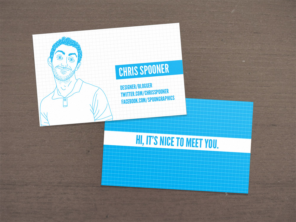
The similarity of the two business cards above is that they have the image/logo/picture on the left. And the information is on the right. I like that a lot because there is a rhythm to it so it looks right and it has a flow to how you will look at the card. But I like the info side of the blue one more because there is a white space above the info and it doesn't take up the whole half page while the other half is empty. The black one I think is tricky if the logo stays that way. Because if it does it like the blue, it would look too empty (as the logo is tiny). But if it is how it is right now, the right half just looks too busy and it isn't balanced. So I think Maybe making the logo a bigger would help. Although, on the other side, I like the black card more. I like how the logo is placed in the centre. And if I have the space I think I would do so too with the same size. I think its size is a very good one because it is a logo, so if you make it too big, it kind of loses proximity when you look at normal distance, and unity is gone. However, too small is not catchy enough and just how can people see it.

Develop a detail design brief:


Our products are kind of similar to Samsung. We sell electronics including washing machines, vacuums, televisions, refrigerators... but we are well-known for our phones and gadgets.  My company name should be SLS (stand for Simply Live Smart). Because "smart" is something human are working towards, and innovative kind of pairs with it. The smarter the more innovative. And putting the simple adjective inside makes it sound more simple, and we make our point clear: Live Smart and we will help you do so. This idea is from LG. SLS takes up about 6%-9% share on the global market of mobile terminals and about 4% share for other products. Kids start to have phones around 8, and some elderly use smart phones ad other gadgets too. But we mainly focus our gadgets on teenagers to 50-year-old people. However, washing machines and refrigerators and essential for all families. We have a wide range of products and their prices can vary 10 times, so low, middle, and high class people use our products. But when using our products, people shall feel cool, stylish and a bit luxurious. Our company is global, but mostly in developed country where people can afford and bother to get a good quality electronic. Our customers and clients will be people that catch up with trend, and value and love technology, and like to seem high class (luxurious, quality). However, everyone needs a phone and house electronics so even if the don't really value these, they'd find the best ones among the same price, or the cheapest among the same quality. I need a business card and a logo. I want people to always pay attention, remember, and recognise my company from it. Standard size with sharp corners. It will be used mainly when I see my clients. The logo should first letters like Sony ericsson and a face kind of thing like LG should be considered. That is my taste. It has to be done around the 13-10-2014. Budget should be around $750.

Branding:

Colour:
#feb402 - orange (orange that is a little bit yellow), Means creativeness, confidence, friendliness
#00ccff - Light blue, means smart, loyal, dependable, strong, digital
#acacac - Grey, means professional, authority, practical
They contrast too, grabs attention using one another.
About 63% blue, 30% orange, 7% grey

http://www.pinterest.com/pin/195202965074139752/

Font:
Modern, neat and tidy